Kitchen Remodel – From dark and dated to bright and beautiful!
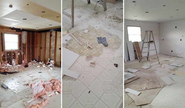
I am so excited to be sharing my full kitchen remodel with you today! My husband and I recently bought the farm site I grew up on from my parent’s. We have been hard at work remodeling and making it our own from the minute they moved out. It is a great house with tons of space, but the finishes and decor were very much outdated. We refinished about every surface on the main level and the kitchen got a full gut right down to the studs.
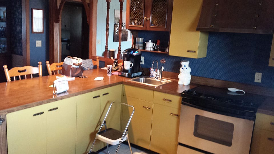
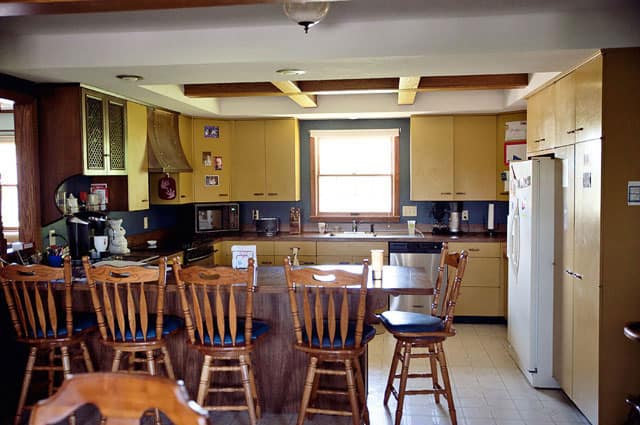
The harvest gold kitchen cabinets were original to the house, when my grandparents built it in the early 1970’s. When we first started planning the kitchen remodel, I searched for someone who could paint the old cabinets. Auto body shops, industrial painters, etc., but no one wanted to touch those things with a ten foot pole. They were afraid the paint wouldn’t adhere well enough for the daily wear and tear a kitchen would see. After much back and forth, I convinced my husband we needed to start from scratch.
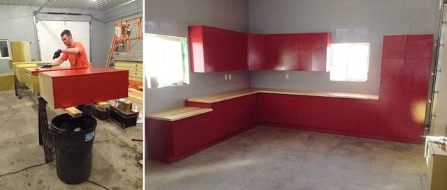
The good news is, the cabinets didn’t go to waste. Some friends took out the cabinets, painted them red and re-installed them in their new shop they were building at the time. We were happy to see them put to good use!
We tore down the wall between the kitchen and living room as well as removed the soffits and faux beams on the kitchen ceiling. This resulted in us replacing all of the sheetrock in the space. It would have created just as much cost and work to patch everything, so we felt it was best to take down the sheetrock, add some insulation and start fresh.
Now that the demo was done, it was time to get to the fun stuff! I had agonized over every finish in this kitchen, from the color and species of the hardwoods, to the glaze on the cabinets and the backsplash tile at the very end. It wasn’t easy trying to envision how everything would come together, but in the end I am thrilled with how it turned out.
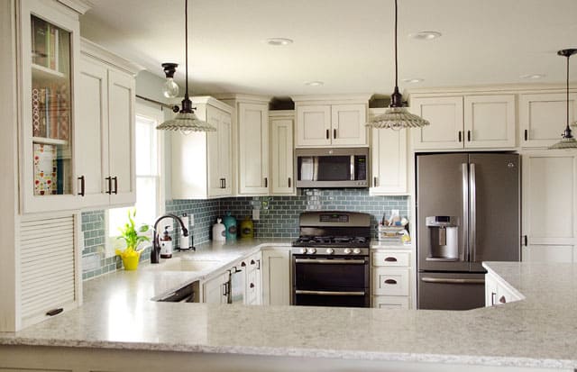
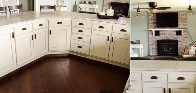
For the majority of the main level we went with Anderson Casitablanca Forged Bronze engineered hardwoods, that we got a good deal on from Unger Furniture. I wanted to keep the flooring the same so it flowed throughout the main space. That meant wood in the kitchen, but I am not a big fan of wood cabinets on wood floors so I opted for white cabinets.
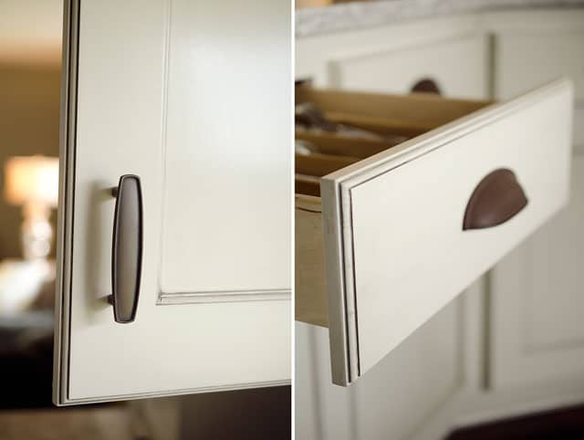
White scared me because I am not the cleanest person, so I worried about them looking grungy. I decided to add a charcoal glaze to pronounce the details in the woodwork as well as helping to camouflage small smudges and fingerprints. The finish matched up wonderfully with the Amerock Antique Rust Pulls. One month in and I am happy with my choices. They keep clean and look great!
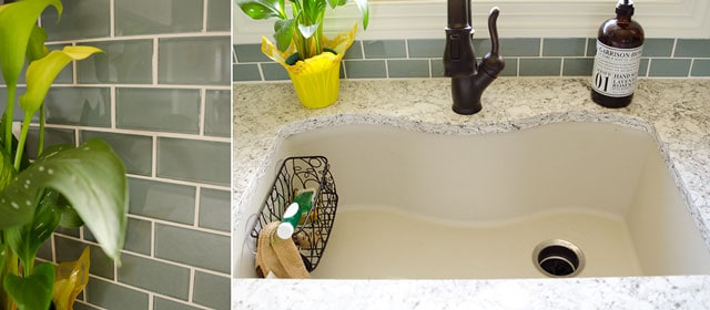
I debated even having a backsplash at one point, but at the end of the day I know I am a very messy cook and I thought it was best to have the protection on the wall for easy cleaning. Because the Midnight Eclipse quartz countertops had a busy pattern going on, I wanted to keep it simple, so I went with a 2″x4″ Water Glass Tile from The Tile Shop. My brother was nice enough to come home the weekend of our move, to not only help us move, but install the backsplash. It added just the right amount of pop, with the color and sheen from the glass.
One of the many things I am excited about in my new kitchen is my huge sink. I had a shallow double sink in my last house that I hated. Whenever you wanted to clean a cookie sheet or anything large, it would be just about impossible. I didn’t have to do much searching to find the perfect sink. My parents just build a new house and installed this Elkay Harmony E-Granite Undermount Sink in Bisque and I loved it. I like the shape, but mostly I just love how flipping big it is! I added this suction basket
to the side of the sink so I had an accessible spot to store my scrubber and dish rag, but keeps them out of plain sight.
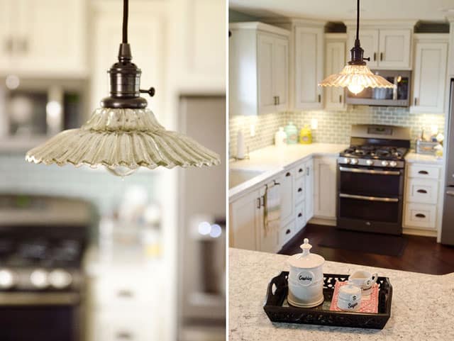
I think the pendant lights were one of my biggest stressors in the entire remodel. It wasn’t that I couldn’t pick out a pendant, but I couldn’t decide on how to lay them out. Because we tore the wall down between the kitchen and living room, it didn’t make sense to put them over only the eating area. I worried it would look too choppy.
I thought about not having pendants at all, but then my brother suggested just wrapping them around all of the exposed counter space to help define the space. His suggestion was perfect and I decided to splurge a bit on these Classic Whitney Pendants from Pottery Barn. I am so glad I did, because the mercury glass is a great addition to the otherwise clean and simple look of the kitchen.
I copied my friend when it came to appliance and went with the GE Slate Collection. I thought the muted grey would look great with the other finishes, but most importantly, it shows far less fingerprints and smudges than traditional stainless steel. I contemplated having a double wall oven, but the layout of my kitchen just wouldn’t allow it without sacrificing too many other things.
Instead, I went with the gas double oven range and kept the old electric range from the previous kitchen in the basement storage area. My electrician added a 220v plug for it, so now for holidays I can just pop my ham in the basement oven and fuss over all the other dishes in the kitchen. I have to take this opportunity to give our electrician a shout-out. John Kleindl did an amazing job and was so patient and accommodating with some of the last minute changes and challenges I presented him with.
The great part about having lived in this house for 18 years prior to buying it, is that I was incredibly familiar with the layout and functionality of the space. Some of the reason I initially considered painting the gold cabinets, was because the layout was essentially perfect the way it was. The only qualm I had was the long distance between the stove and refrigerator. I moved the stove over to the other side of the kitchen so I wouldn’t be splattering sauces into the living room and on to my sectional and it would create a smaller work triangle. I also flip flopped the dishwasher and trash cabinet to opposite sides of the sink.
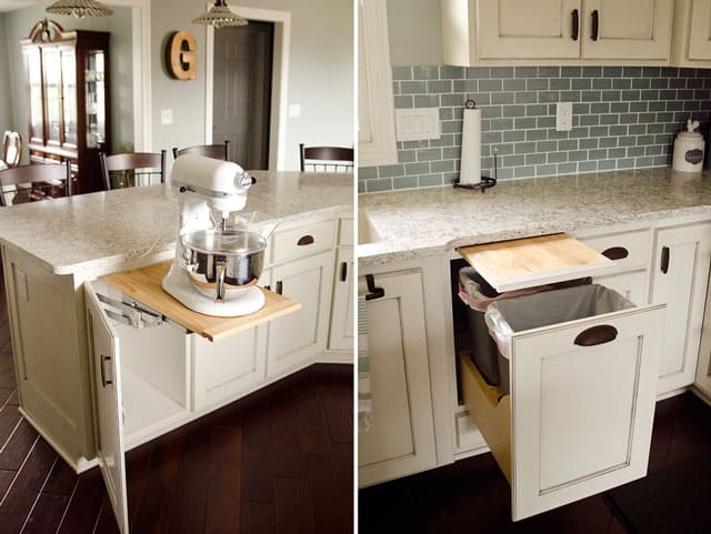
Apart from those changes, the layout stayed the same. The only other big change… well, you know, apart from ALL the new finishes, was that I added some more modern conveniences and storage. At the top of that list, was a pop-up stand for my Kitchen Aid mixer. In my old house, my mixer was buried at the bottom of my closet and it rarely got used. Now that it stays plugged in and I can just pop it up to counter level, I have already used it for multiple baking projects!
Let’s talk about the cutting board for a minute. This is seriously my favorite thing I did in this kitchen. I had a pull out bread board in my last kitchen and I liked how much extra space and convenience it provided. The only trouble was, I would carry the vegetable scraps across the kitchen to the trash and would inevitably spill along the way. I knew from the start that I wanted the bread board directly above the trash. Even my husband, who cooks very seldom, has commented on how awesome it is being able to scrape the garbage directly into the trash without making a mess.
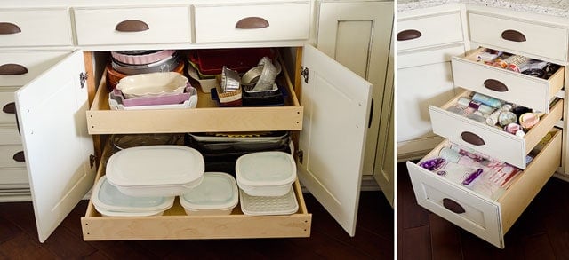
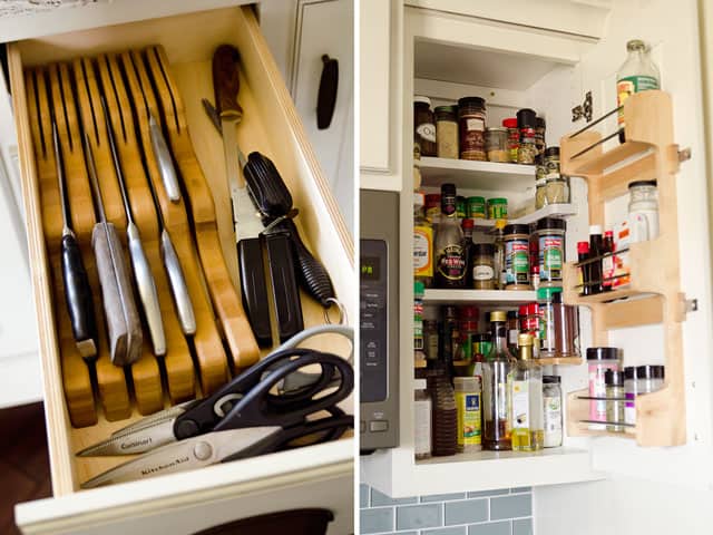
Storage solutions didn’t just entail pull-out shelves in the cabinets and full-extension drawers, it encompassed every little detail that I could optimize for my cooking process. Because I obviously love to cook, and spend a great deal of time in the kitchen, I added on lots of little extras, like a Spicy Shelf for clear viewing of my spice collection and a drawer knife block
to de-clutter my counters.
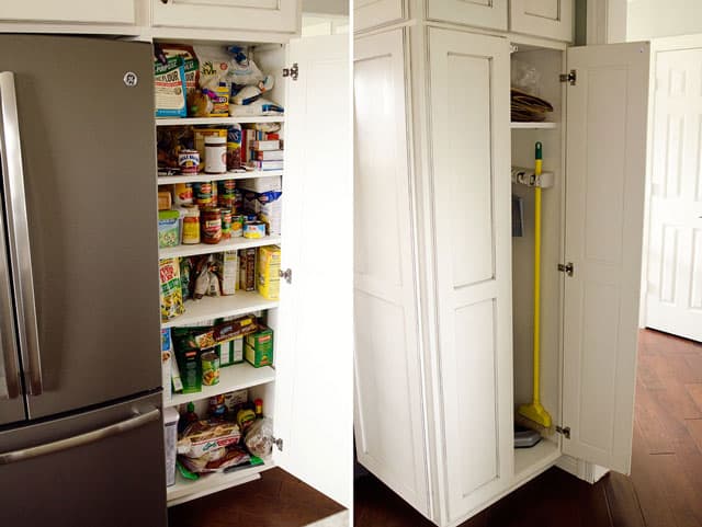
I took a note from my sister’s kitchen when it came to designing the pantry. She has this cute little side access on her deep pantry where she stores her dog food and supplies. I thought that would be a great solution for a broom closet and the best part is that it makes the pantry shallow. This may seem counter-intuitive, but when I have a deep pantry, things quickly get lost and forgotten in the back of the shelves. My new pantry allows me enough space to organize everything neatly without forgetting or loosing what I already have.
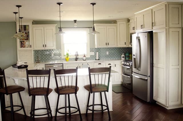
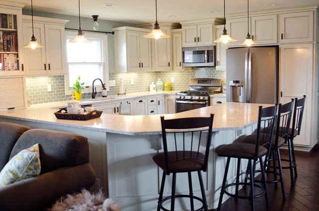
This is the beautiful new view from my kitchen to living room. In the past, it was dark and enclosed. Now when I get home from work, I can pop on a talk show in the background while I whip up dinner and enjoy all of the natural light flooding in the space!
It’s been almost a month since we moved in and I have to say, every day I walk into my kitchen it puts a smile on my face. I love how open and airy it is as well as functional and pretty!







Thomas says
Where did you find that pop up stand for your mixer?
Danielle Green says
My cabinet maker had it as an add-on option. I’ve seen other people buy them on various sites online though.
Nicole says
I love this countertop! Where is it from?! The link you have with the countertop name isn’t working ?
Danielle Green says
I got it from our local cabinet maker. The link was to the manufacturer who makes it, so unfortunately that probably means it’s no longer in production. ?
Jenn Vanelli says
I fell in love with your kitchen remodel. So much that I purchased EVERYTHING you did and remodeled my condo kitchen exactly the same way! The only thing I changed was the back splash. I painted my walls Sea Salt from BM and am going the same route w the back splash but in a tan or light gray color. I even purchased the same appliances! You were a great inspiration and made my kitchen remodel a breeze!
Danielle Green says
Oh wow, that is so awesome! I am so happy to hear it helped you with your own remodel. I would love to see pictures of your finished kitchen!
Ceann Wombacher says
Did you get a counter depth or full depth fridge?
Danielle Green says
I went with a standard fridge.
Sara says
You did a great job on your remodel! We are nearing completion on our own 1970s kitchen renovation and I can only hope it looks as good as yours when we are 100% done. What was the deal with the dark kitchens back then? Ours was possibly even darker that yours started out at. I have lots of before pics and a few in-progress pictures of our kitchen on my blog at http://www.onhouseandhome.com.
Darcie Bristow says
Love this kitchen! I went to The Tile Shop but I’m having a difficult time finding something similar in size and color. Would you happen to remember any additional information or a direct link by chance?
Thanks so much!
Danielle Green says
Hi Darcie, thanks for the kind words!
https://www.tileshop.com/search.do?query=glass+amalfi
These are actually the exact color and style I used in my kitchen. 🙂 I do remember the picture being a little different than my actual samples I got.
If you have a Tile Shop close to you, they are so great about sending you home with samples at no charge, so I highly suggest you try that. Otherwise, I do think that they sell samples on their website, so you can be certain you like it before buying it all.
Best of luck!
Amy says
Hi! Can you let me know what your wall color is? I just love it (and everything else)!
Thanks!
Danielle Green says
Hi Amy, the paint color is called Shady Cove. (D35-4) and it was purchased at ACE Hardware. Just an FYI, a friend tried the same paint in one of her rooms and it looked much more grey than blue, so it definitely is dependent upon the lighting in your home. Thanks for the kind words!
Sam Fisher says
If I didn’t know that it was your kitchen in the 2nd picture, I would of never guessed that it was. It really is amazing at what you can do with a bit of time and perseverance. However, it is important that you make some sort of plan so that you know what you will be doing.
Tricia Downard says
Love the look of your kitchen! Our newly remodeled one looks very similar. I am looking at getting the GE slate appliances as well. Can you tell me the model #’s of yours please? Are they still working to your satisfaction? Any problems with the water dispenser dripping, or the frig being “noisy”? Those are the two complaints I have read on reviews. Thanks so much!
Danielle Green says
Hi Tricia, I don’t know the model numbers anymore, but I do know that the fridge model I got was discontinued at the time anyways. As far as their performance, I have been very happy with them. The fridge doesn’t drip nor is it noisy at all.
Tricia Downard says
Thanks for responding! Glad they are working out for you 🙂
Kyle Knapp says
Hi- Great transformation! Love the look down do the pulls and handles and all the pictures. We are looking at a very similar change to our kitchen, particularly in design and even the appliances. How has the slate look been and how have the GE appliances been for you?
Danielle Green says
Hey Kyle, I have had the appliances for a little less than a year, but so far I have been very happy with them! I love the look and the smudge-free surface. I do wish the handles were made from something other than stainless because they do show lots of smudges and marks, but that is my only real complaint. They function and look fantastic!
Heather @ Sugar Dish Me says
So gorgeous!!! We are in the middle of house destruction and I have put off the kitchen because all the descisions scare me. But it’s almost time. I looked for links and found everything but cabinets — who did yours?
Danielle Green says
Thanks Heather! The cabinets were made by a local custom cabinet shop.